Do higher-ranked schools tend to charge a larger tuition? Does a professor’s salary positively correlate with college tuition? In this post, we’ll explore the relationships between college tuition to a couple of factors, such as professor salary, school rank, freshman retention rate*, and 6-year graduation rate.
If curious about the underlying data-set, please see our post: ABCD: Analyzing Big College Data.
Concepts
How can we explore the relationship between two items such as tuition and school rank? One approach is to calculate the correlation coefficient. Known as r for short, the correlation coefficient is a measure that describes how strong the linear relationship is between the two variables. It will always be a value equal to or between -1 and 1. The closer r is to 1, the closer the two variables are to achieving a perfect positive linear relationship, and vice versa.
If r is positive, we can infer that the two variables move in the same direction. For instance, let’s say that the correlation coefficient between variable x (amount of exercise) and variable y (cardio endurance) is positive. This implies that the more exercise you do, the higher your cardio endurance is.
On the flip side, a negative correlation suggests that the two variables move in opposite directions. For example, if we keep variable x as the amount of exercise and change variable y to fat level, a negative correlation coefficient indicates that the more exercise you do, the lower your fat level is.
In addition to calculating r, let’s also square r (e.g. r x r). Known as r-squared (or more formally known as the coefficient of determination), this figure measures how much of the difference in one variable (y) can be accounted for or explained by the difference in another variable (x). So, back to our first example: if the correlation between the two variables (x = amount of exercise; y = cardio endurance) is 0.7, then r-squared is 0.49 (0.7 x 0.7). This measure implies that 49% of the variation of cardio endurance can be explained by differences in exercise levels.
Calculations
Great! So with this background on these two measures, let’s see how we calculate the correlation of tuition against each of the factors (professor salary, school rank, freshman retention rate*, and graduation rate). We can calculate this measure across all 202 schools in our data-set. For fun, let’s also divide our dataset into two groups, private schools and public schools and see how correlations differ.
In a spreadsheet, there are two functions (pre-set formulas) that calculate the correlation coefficient and r-squared. This video reviews the concepts and discusses how to use the functions in spreadsheet: CORREL and RSQ. Instead of using the RSQ function, an alternative method to calculating r-squared is simply to square the correlation coefficient (r) using the small carrot symbol (^) followed by 2.
Findings
Across all 202 U.S. colleges in our data-set, we find that tuition is positively correlated to:
- Professor’s average salary
- School rank
- Freshman retention rate*
- 6-year graduation rate
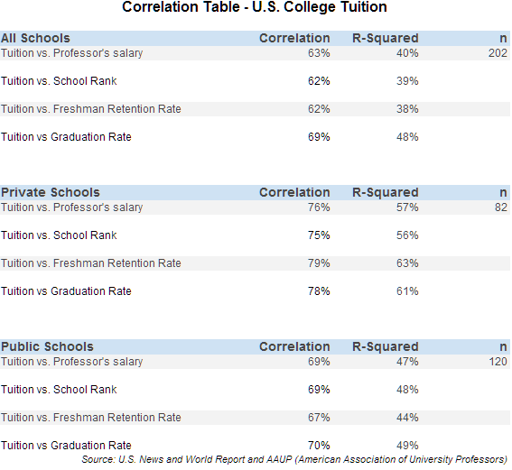
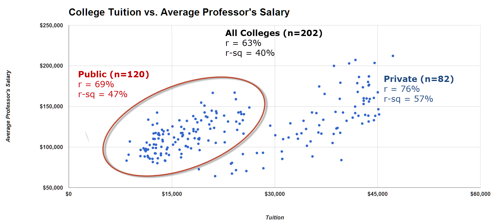
As shown in our chart above, the correlations for each of these relationships range between 62-69% with r-square measures ranging from 38-48%.
A quick note about the school rank. School rank is defined by the U.S. News and World Report and begins with 1 as the top-ranked school, followed by 2, 3, and 4, etc. So, essentially, the lower the number, the higher-ranked the school is. We switch the sign of the correlation – solely for interpretative purposes. For example, the straight calculation of the correlation between tuition and school rank is -62%. This implies that a lower numerical rank (i.e. the higher the school prestige) is associated with a higher tuition. By switching the sign to positive 62%, we can equivalently say that a better-ranked school is correlated with a higher tuition.
When we separate the data-set into two smaller sub-sets (private vs. public universities), we generally find that the correlations become stronger – particularly among private schools. As seen above, the correlations for each of the factors ranges from 75% to 79% among the private college universe.
Your Challenge
Creating a scatter-plot is an excellent way to see the relationship of the two factors – as shown below. Do you know how to create a scatter plot when given the data-points? Our challenge to you is to create this type of graph with the data we provide. For the underlying data, please click here: University Data. Stuck? For a reference guide, refer to our video here: Scatter-plot.
* Freshman retention rate data is from the U.S. News and World Report website and is defined as the percentage of students who returned the following fall averaged over the first-year classes entering between fall 2007 and fall 2010.
Related Posts: