
The college decision is a big one. Are you deciding which college(s) to apply to or which one to attend? Or are you in middle or high school and interested in attending college someday? Or have you already graduated from college?
For all, let’s explore essential skills by analyzing data across 202 U.S. colleges!
You may be wondering: Why care about accessing and analyzing data?
Data Analysis – Why?
Knowing the tools of data analysis allows you to:
- identify trends and recognize patterns (valuable skills in college, workplace, and in general for the rest of your life!)
- apply skills to real-world applications across any discipline (such as dog cognition, human resource management, health/medicine, etc).
- discover potential conclusions and implications (not every analysis results in these, but the possibility exists!)
- better inform your college decision-making process (if the decision has not yet been made!), and
- have fun (yes, it’s true!)
Collecting the Data
If you are intrigued (even if just a bit), let’s begin! What university-related data should we consider? Let me ask first: how would you decide which schools to apply to or decide upon your final college choice? Chances are you would consider some factors, such as tuition, school rank, or location among others. This is a great start. Fortunately, the U.S. News and World Report also provides data such as average freshmen retention rate and 6-year graduation rate. From AAUP (American Association of University Professors), we can also access data on professors’ average salary figures.
From these sources, we’ve collected all this data into a spreadsheet, a tool that will help us with our data analysis. So, what exactly can we do with this information? Using this data, we can explore some interesting questions:
- How does tuition differ between a typical private vs. public college?
- Which U.S. region has the highest and lowest average university tuition?
- Do colleges with larger tuitions tend to offer higher professor salaries?
- Do colleges with better graduation rates charge higher tuitions?
Broadly, we can group these sample questions into two groups: the first two questions are related to summary/descriptive analysis, and the last two are focused on inferential/correlation-based statistics. In this post, we’ll focus on the first. In our next post, we’ll cover the latter, which you can access here: https://spreadsheetsolving.com/schoolrank-salary-tuition/
Descriptive Analysis: Summary Statistics
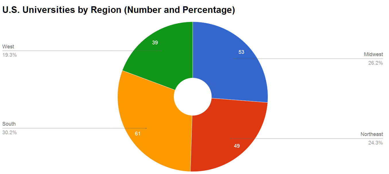
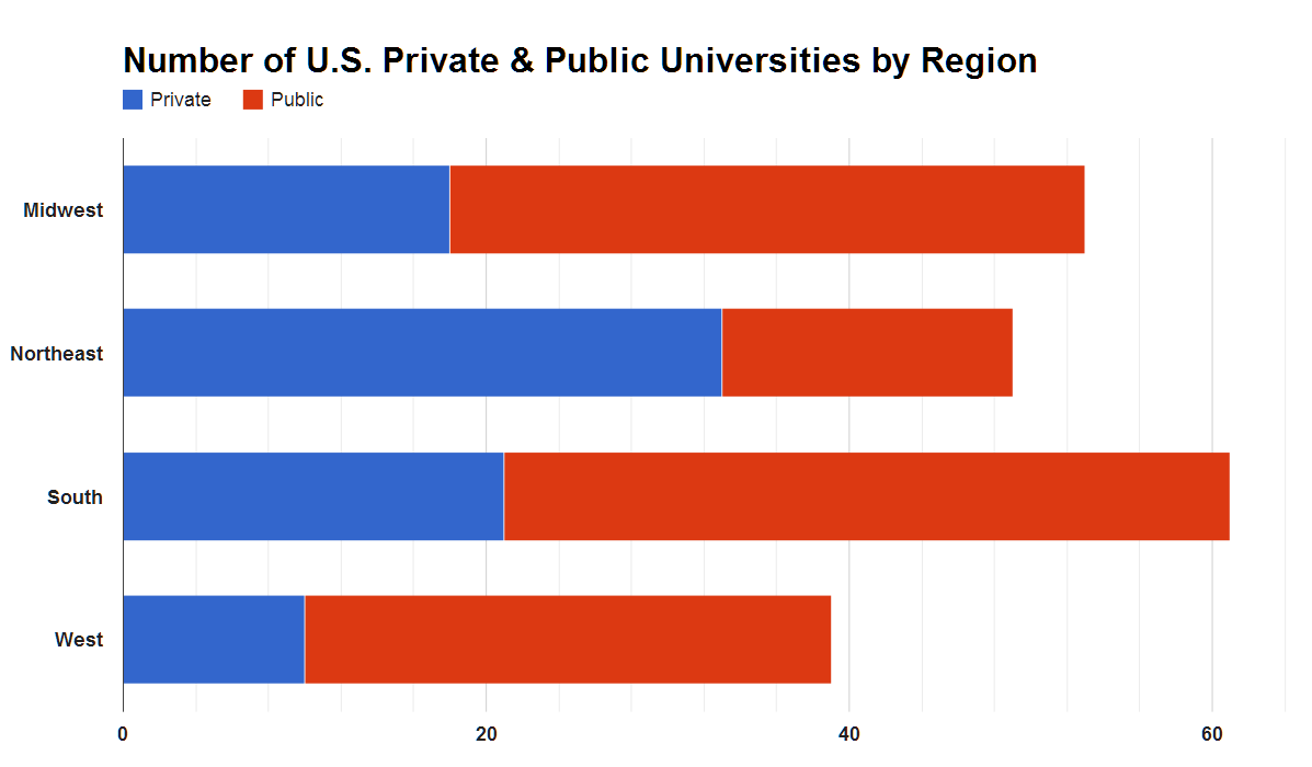
Conducting descriptive/summary analysis helps us understand the distribution of our data. Let’s categorize our data first. How many private vs. public universities are in our sample? Is our data-set broadly represented across all U.S. regions?
Our sample data-set is fairy well-represented geographically (roughly 20 to 30% of our data set is represented by each of the 4 U.S. regions). With respect to representation by type, our sample of schools is tilted to public schools (60%) versus private schools (40%).
Here are a few charts (an excellent way to visualize data) that describe the breakdown of our sample data-set.
Other questions to consider in our analysis: Across all our data, what is the typical or average value (measures of central tendency)? How far do our data points diverge from the typical value? Are there any outliers? Our table and charts below apply these questions to college tuition data across geographic region and university type (private / public).
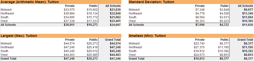
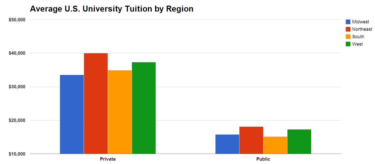
Unsurprisingly, by region, colleges in the Northeast on average charge the highest tuition, while colleges with the lowest average tuition tend to be in the Midwest (private colleges) and the South (public colleges). Within our sample data-set, Columbia University boasts the highest tuition, while the University of Michigan charges the highest tuition across public schools only.
How did we do this?
Shown above, how did we calculate the average (arithmetic mean), standard deviation, and largest and smallest values? There are several ways to do it in a spreadsheet. We suggest the following:
1) Use the appropriate functions, which are pre-set formulas. View our tutorials below for an introduction to the functions:
- Central tendency: Average, Median, Mode
- Dispersion: Standard deviation and Variance
- Outliers: Minimum / Maximum, Small / Large
2) Use the pivot table, which is arguably one of the most powerful and under-utilized spreadsheet tools for data analysis. Without using a single formula, a pivot table grants you the flexibility to pivot or rotate data, see different relationships, and tally up data values.
For resources on charts and graphs, select the following:
For a read-only version of our sample spreadsheet, please select here. To edit the spreadsheet, please first save it on your Google drive: Colleges – Dataset Characteristics
Related posts: