Teach kids to multiply with this spreadsheet

Today’s spreadsheet may help you introduce the concept of multiplication to your kids. Rather than walk through how to build the sheet step-by-step, we’ll include the download link and focus on how it works and how we tried (only semi-successfully with the bribe of TV) to use it.

Download the spreadsheet here: Multiplication Spreadsheet

How it Works

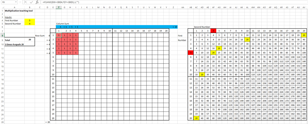
The spreadsheet includes 2 tables – a visualization grid and a traditional times-table.

First, input any two numbers (from 1 to 20) you wish to multiply. In our example, we entered 5 x 5 by putting 5 in the input cells B4 and B5 (highlighted in yellow). You can go as low as 1 x 1 and up to 20 x 20.

Now let’s explore the visualization grid (on the left) and the traditional times-table.

How to Use it
  • Visualization Grid: This grid is designed to help kids visualize the multiplication concept, by tapping into their understanding of counting and addition.

For our example, you will see a a 5 x 5 block of 25 pink cells. As a start, the kids can count the cells. Next, you can direct them to the blue row on top across the top of the grid. Here you can see that 5 x 5 is broken out into a more familiar addition problem of 5 + 5 + 5 + 5 +5 = 25.

  • Times-Table: On the right is a standard times table, where we tried to highlight the relevant square. So, in our example, you’ll see that the inputs 5 and 5 are highlighted in red and the answer, 25 is highlighted in yellow.

You’ll notice that if you try different combinations, you may see more than one cell in yellow. For instance, if we used 4 x 5, then every cell with 20 will be in yellow (this is a conditional formatting nightmare).

Let us know if you tried this sheet out with your kids or if have some elegant solution for formatting the right table!

Stay home, flatten the COVID-19 curve, and build spreadsheets?

The COVID-19 outbreak has caused many families (including us) to be stuck at home with their kids. While not having to commute has been great, we’re two days in and quickly running out of interesting activities. Perhaps now is the perfect time to learn how to build spreadsheets to analyze data?

If you’re interested, we’ve organized certain spreadsheet skills into a curriculum of sorts, located here. However, the best way to learn spreadsheets (and the motto of our website) is to use them to solve real world problems and figure out how to get through roadblocks on the way.

So today’s spreadsheet is a simple one.  We’ll build a sheet that can track coronavirus cases in the US by following the CDC data. First, we navigate to the CDC website tracking COVID-19 cases and then copy in the data near the bottom of cases reported in the US by onset date:

We paste this into our spreadsheet and add a formula in the row below to keep a running tally of cases:

A few clicks later, and we produce this spiffy graph:

The total numbers looked low, so I should probably paste in the data asterisks:

To access this spreadsheet on Google Docs, you can find it here: COVID-19 Case Tracker

My Life in a Tree Map

Tree
Grand Teton, WY. Photo: Amie

How does my life compare to the average American’s? What does my ideal day look like? With data from the Bureau of Labor Statistics (BLS), Google spreadsheets, and problem-solving skills, let’s conduct some analysis with Tree Maps.

Continue reading “My Life in a Tree Map”

How to Track & Analyze Spending

Where does your money go? This is an important question, because it gets to the heart of basic money management and personal finance. Let’s discover and create a spreadsheet application that tracks and analyzes your spending!  Continue reading “How to Track & Analyze Spending”

How to Visualize Data

Is the typical New Yorkers’ overall “well-being” better than that of the national average? Nope! How did we quickly conclude this? Check out the graph to the right. Data visualization is an effective (and fun) way to understand information!

Too much information can be overwhelming. But there are ways to channel the desired data and convey it in a way that makes it quick and easy to understand. Let’s discover the power of data visualization by creating a flexible, automatic tool shown below. To see this tool live in action, see our 2-minute video below:

Continue reading “How to Visualize Data”

How to Create Charts in Google Spreadsheets

"How I Met Your Mother."  Source: YouTube
“How I Met Your Mother.” Source: YouTube

Charts are everywhere – books, newspaper articles, magazines, ads, and even TV shows [Click here for a video clip of How I Met Your Mother]. Valuable, practical, and fun, charts enable us to visualize and understand data. In 3 steps, you can build any chart in Google spreadsheets. Continue reading “How to Create Charts in Google Spreadsheets”

ABCD: Analyzing Big College Data

© Photographer Daniel Gilbey|Agency: Dreamstime.com

The college decision is a big one. Are you deciding which college(s) to apply to or which one to attend? Or are you in middle or high school and interested in attending college someday? Or have you already graduated from college?

For all, let’s explore essential skills by analyzing data across 202 U.S. colleges! Continue reading “ABCD: Analyzing Big College Data”

Pampered Pooches: Is Pet Spending Recession-Proof?

sushi
Sushi (Photo: May Ko)

When asked which child she adores most, my mom would remark without hesitation, “Sushi is my favorite.” Sushi is an adorable 7-year-old schnauzer. As many may relate, pets are a part of the family, with a few lucky ones elevated to “favorite child” status. Continue reading “Pampered Pooches: Is Pet Spending Recession-Proof?”

NYC Subway Passenger Habit Charts

© Photographer Oscar1319 | Agency: Dreamstime.com

The Metropolitan Transportation Authority (MTA) recently published an observational study of subway rider seating behavior. Collecting data over three weeks in late winter 2012, the researchers published their findings on rider seating preferences in a draft report: who finds seats when the train is crowded? Do standing riders prefer vertical bars or graspable handles?  Which seat type do sitting riders take:  seats near a door or bench spots?

Based on some of the data from the report, let’s create visuals – charts that offer us a glimpse into some questions: Continue reading “NYC Subway Passenger Habit Charts”

Pivot Table & National Volunteering Month

April is National Volunteering Month, so let’s celebrate!  What better way is there to celebrate than to honor those who devote themselves to their communities while simultaneously mastering a pivot table?  That’s right – you heard me!

Continue reading “Pivot Table & National Volunteering Month”

How many languages do you speak?

[polldaddy poll=6994482]

Over the past several months – or years for that matter – there has been a rush among American parents to teach kids Mandarin.  After-school language classes have emerged, immersion programs are gaining popularity, and videos and phone apps focused on languages have sprung up!

A recent Economist article, “Valued-Added Remodeling” (March 16, 2013) even noted that Jack Markell, Delaware’s governor, plans to expand immersion programs, such as those seen in the kindergarten classroom of Mcllvaine Early Childhood Center, where children are taught solely in Mandarin for half of each day.

Now, what’s the connection between our language skills and a spreadsheet? Continue reading “How many languages do you speak?”

Employment Patterns by Gender since 1948

In honor of Women’s History Month in March, check out our poll below:  what percentage of the work force consisted of women in 1948?  Keep in mind that just 28 years prior to 1948, women were first granted the right to vote.   How have employment patterns by gender changed over time?  Let’s use our spreadsheet problem solving skills to figure this out!

[polldaddy poll=6991261]

Continue reading “Employment Patterns by Gender since 1948”