Many financial scams today do not look like scams at all. Fraudsters often use familiar tools, polite language, and simple requests, which is why many people fall for them. Some of the most effective scams never ask for our password, Social security number, or money at first. They seem harmless. But the information collected can later be used to open the door to fraud.
Let’s see how this unfolds.
As we open our computer, we receive the following message.
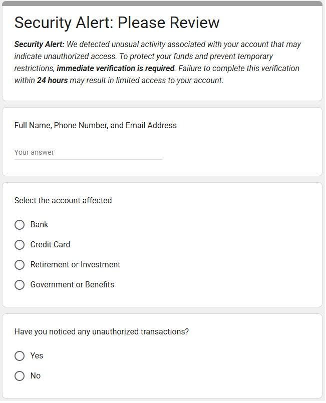
At first glance, there is no request for passwords or money. The message feels urgent but not dramatic. Still, it suggests serious consequences if we don’t act.
It seems reasonable enough, so we submit the form. No losses today.
The harm comes later.
Armed with our personal information, scammers can now target us more precisely and effectively. Fraudsters constantly collect and sell lists of potential victims. Once we fall for a minor scam, we may be added to what are known as “mooch lists” and targeted repeatedly.
Soon after, we receive a follow-up from someone pretending to be our bank, credit card company, or government agency. Scammers can “spoof” phone numbers: the caller ID can say the call or text is from a bank, even if untrue. This second contact feels even more convincing, because it includes our name and account type and appears to be a logical continuation of the first message. We are urged to confirm account numbers, move money to a “temporary” account, or receive a one-time passcode sent to our phone. At this stage, real money is often lost.
What’s especially concerning is how easy it is to create a convincing scam. Would you have known we created the form in Google Forms in under five minutes? It uses no malware, is hosted on a trusted platform, and asks for “harmless” information that can later be exploited. Now imagine what more advanced technology can do to make scams look even more official.
Who is Affected?
While financial scams affect anyone, older adults (ages 60 and over) tend to report higher median losses than younger age groups. Why do older adults tend to be targeted?
The Federal Bureau of Investigation (FBI) highlights several reasons:
- Seniors usually have money saved up.
- Seniors tend to be trusting and polite.
- Seniors may be less likely to report fraud, because they don’t know how or feel embarrassed at being scammed.
A Scientific American article also explains that artificial intelligence (AI) has worsened senior fraud. Scammers now use AI to manipulate voices, videos, photographs, and documents, making scams far more convincing.
Social isolation can also play a role. Losing a spouse or divorce may leave some older adults without support systems or skills their partners once handled.
How Much is Lost?
According to the Federal Trade Commission (FTC), seniors who reported fraud lost $2.4 billion in 2024 — up from $600 million in 2020, a four-fold increase.
Even more troubling, the FTC believes actual losses are far higher because most fraud goes unreported. Estimates range from $10 billion to $80 billion annually.
This problem is devastating to anyone, but especially to seniors, who may not be able to earn back what they have lost.
How is This Happening?
There are many ways seniors are being scammed.Here are a few common:
- Business Impersonator Scams: A caller claims to be from a well-known company and demands payment for a subscription renewal using gift cards. Or someone posing as Amazon or a bank claims there is a fraudulent charge and instructs you to move money to a “safe” account, which actually belongs to the scammer.
- Government Impersonator Scams: A fraudster claims to be from the Social Security Administration and says your Social Security number has been suspended because of suspicious activity. The scammer demands immediate payment through gift cards or wire transfers to avoid arrest.
- Grandkid and Family Scams: A scammer impersonates a grandchild or relative in distress and urgently asks for money often through gift cards or wire transfers, which do not require identification.
- Investment Scams: You are invited to a “free lunch” seminar, where scammers pose as financial advisors. They promise high returns on “safe” or exclusive investments that may be fake, unethical, or impossible to exit without heavy penalties.
- Tech Support Scams: A pop-up claims your computer is infected with a virus. The scammer asks for remote access to “fix” the problem and then demands payment or installs malicious software to steal login information.
- “You’ve Won” Scams: You are told you won a prize, but must first pay fees for taxes, shipping, or processing. No prize ever arrives, and scammers often continue requesting more money.
Investment scams, business impersonation, and government impersonation scams account for the highest reported losses among older adults. Other common frauds include charity fraud, health insurance fraud, home repair scams, identity theft, job scams, romance scams, and unwanted calls and texts.
Why This Issue Hits Close to Home
Our family has been living in Rancho Palos Verdes, California (RPV) for the past five years. Recently, we heard several elderly friends had been targeted by financial scammers. As we looked deeper, we realized that fraud against seniors is an important and growing problem, especially in our community.
Based on data from the U.S. Census Bureau, roughly 33% of RPV residents are 60 years and over. In other words, one in three residents in our community is a senior.
This is significantly higher than the national average. While about 18% of U.S. residents are 65 or older, approximately 26% of RPV residents fall into that age group.
Unfortunately, there is no local fraud data published for RPV. But can we estimate how many seniors in our community experienced fraud? Yes. A spreadsheet, along with a few other pieces of data, can lead us to an estimate!
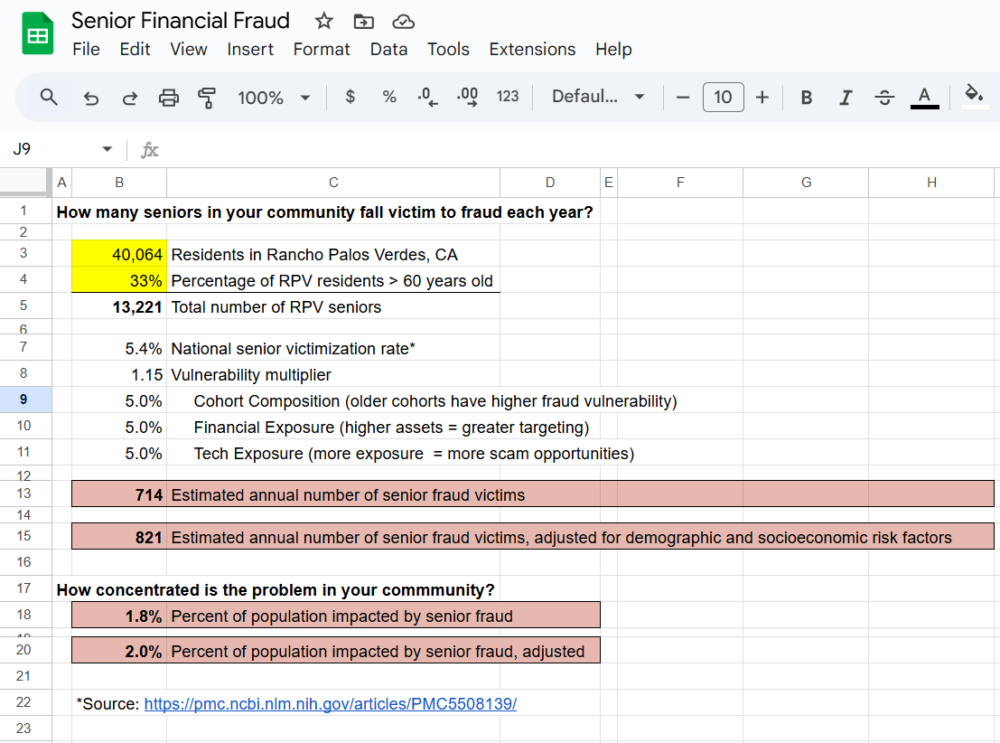
RPV has about 40,000 residents, and one-third or approximately 13,333 people are over 60 years old. According to a national survey, 5.4% of seniors experience financial fraud each year. Applying that rate locally suggests that roughly 714 seniors in Rancho Palos Verdes may experience fraud annually (13,333 x 5.4%).
But this is only a starting point.
Given what we know about our community, we can adjust the national rate modestly up or down using widely-accepted indicators: age composition within seniors, financial exposure, and technology exposure.
Cast your eyes on the table below.
| Indicator | Impact | RPV Reality |
| Age composition among seniors | older cohorts have higher fraud vulnerability | Older-than-average senior population |
| Financial exposure | scammers tend to target those with higher assets | Above-average household wealth and high homeownership |
| Technology exposure | more tech exposure means more scam opps (e.g., phishing) | High broadband access, smartphone, and email use |
For each indicator, we ask a simple question: Is RPV lower, about average, or higher than the U.S. overall? Given an older than average senior population, above-average household wealth, and high smartphone usage and broadband access, RPV likely falls above the national average for each measure.
To reflect our community’s older age profile, higher asset levels, and greater technology exposure, we apply a modest vulnerability adjustment of 5% for each proxy. We combined these adjustments conservatively and rounded down to avoid overstating risk. This approach follows standard practice when local outcome data is unavailable and results in a vulnerability multiplier of 1.15.
Using this multiplier, our adjusted estimate suggests that over 820 seniors in our community may experience fraud each year.
Feel free to use this same spreadsheet to estimate senior fraud in your own community. Save a copy to your Google drive and edit the yellow-shaded input boxes for population and percentage of seniors. We found these statistics on the U.S. Census Bureau Quick Facts site.
Awareness is the First Step toward Prevention
Can we reach these 700 to 900 seniors in our community before it is too late?
Scams succeed when people feel rushed, scared, or uninformed. The good news is that awareness can interrupt that cycle. Staying informed about common scam tactics is one of the most powerful defenses we have. As Francis Bacon once said, “Knowledge is power.”
The U.S. Department of Justice maintains a list of trending elder fraud threats to help people recognize financial exploitation. But information alone isn’t enough—it has to be shared.
If you receive a message like the one at the start of this article, stop, think, and verify. Be suspicious of “phishing,” which happens when you receive an email that looks reputable but asks you to call a fraudulent number, respond to the email, or go to a website and enter personal information. You might even be asked to look at an attachment, which then gives scammers access to your computer if you open it.
Train your eye to notice red flags:
- Vague language (“your account,” “our system”)
- Urgent deadlines
- Requests for personal information
- Links asking you to “verify” or “confirm”
- Messages that don’t address you by name
- No clear way to independently verify the sender
When in doubt, lean toward caution. If you never initiated the contact, do not click, reply, or enter any information, even if the page looks professional.
Be vigilant if you receive a call from a “bank representative” who says you need to send money to another account via a wire transfer to reverse fraud on your account. A bank would never ask you to send money to yourself. When in doubt, hang up and call your bank directly using the number on the back of your card or account statement.
If you see a pop-up message or locked screen, shut down your device and enable pop-up blockers. When you need to check an account, go directly to the organization’s official website, or call a number you already trust.
Protecting Our Community Starts Now
Financial scams are no longer rare or obvious. They are designed to blend into everyday life. But awareness spreads faster than fraud when communities talk openly and look out for one another. Share what you learn. Stay curious. Check in on those around you.
Fraud prevention does not require advanced technology. It starts with simple conversations, trusted relationships, and a willingness to pause and verify. Together, let’s make our community a harder target for fraud.