“If you can’t measure it, you can’t manage it” – supposedly Peter Drucker
A unique feature of the United States is its diverse population, tied together by shared values. Generally a commonly-embraced aspiration, diversity is promoted as a healthy feature of groups within society (usually, although the trend might appear otherwise). But can diversity be measured?
What if we could come up with an index that measures how well “mixed” a set of groups is, a so-called Diversity Score? For instance, can we create an index such that a prison and its subset gangs falls on the less diverse/less well-mixed end and a Benetton commercial on the other? Once we have a method, we can apply it to other places like school districts, college fraternities and sororities, social groupings within a company, and many more. That’s the beauty of spreadsheets!
Spreadsheet Inputs – We will compare how well-mixed the Los Angeles School District is to the San Francisco School District
Our example will be to try to compare the Los Angeles and San Francisco school districts. The motivation behind this example is San Francisco’s lottery changes that allowed students in poorer areas to have a better chance at getting into higher performing schools.
First, we’ll download the breakdown of students by ethnicity data for every elementary school in Los Angeles and San Francisco from www.schooldigger.com:
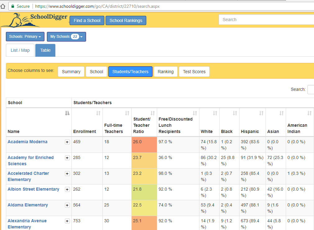
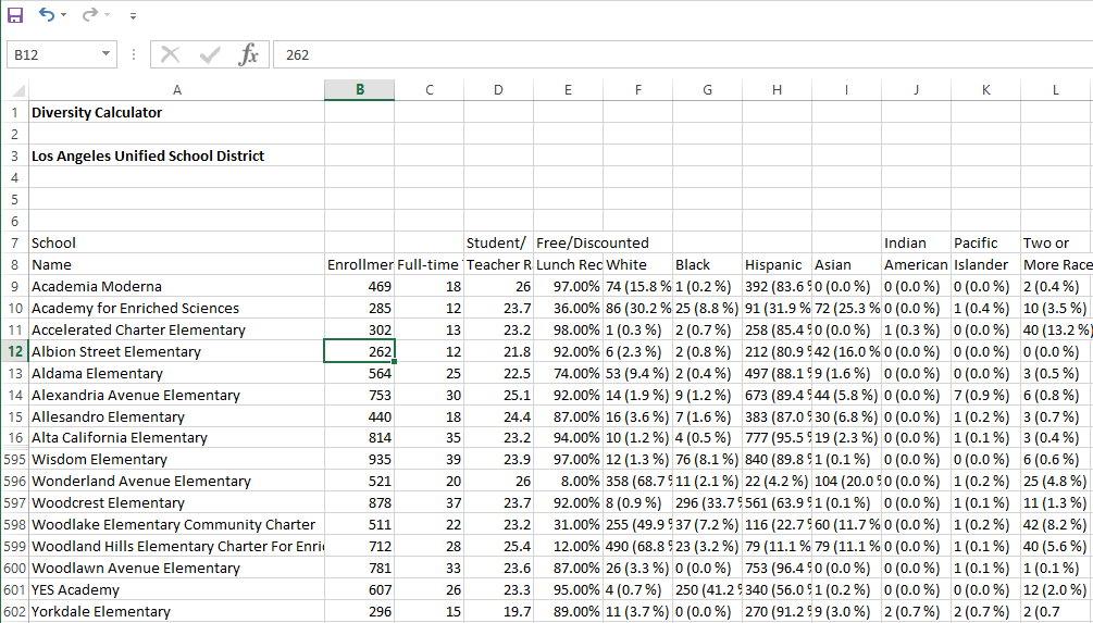
Now we paste it into our spreadsheet:
Spreadsheet Logic and Outputs
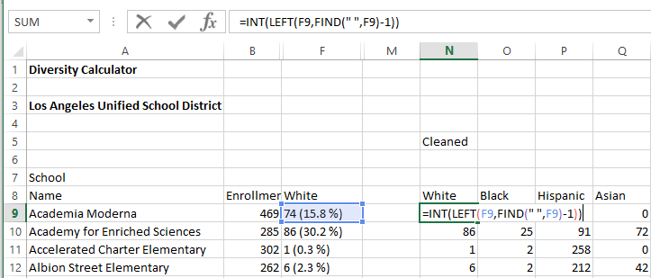
Okay, first the data needs to be cleaned a bit, as we only want the number of students of each ethnicity for each school. This is done with a little trick using the LEFT() function to extract everything up to the space out of each cell:
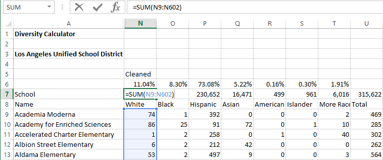
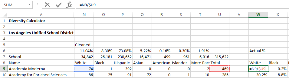
Next we’ll sum up all of the students of each race for the whole district, and calculate district-wide percentages of students of each ethnicity:
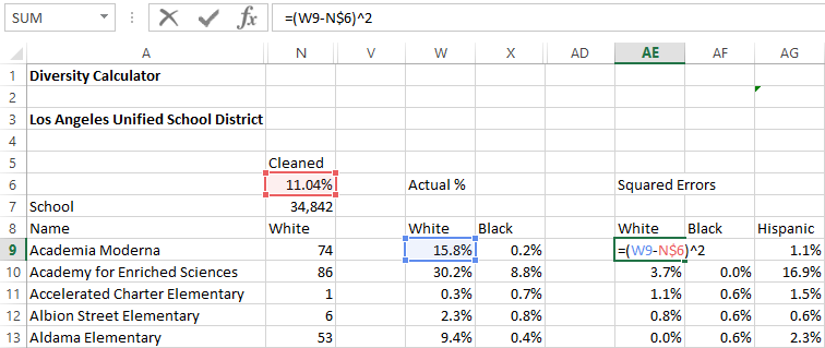
Now for some theory – if a school district were perfectly “mixed”, each school would have about the same percentages of each ethnicity at each of the schools. i.e. all the schools in Los Angeles would have about 11% white, 8% black, 73% Hispanic, etc. If Los Angeles were not well mixed, then many schools might be 100% white, some 100% black and some 100% Hispanic.
Next, we’ll calculate each school’s percentages of each ethnicity:
Next, similar to our post on sports league power ratings we’ll calculate the squared “errors”, which is the square of the difference between each school’s percentage of each ethnicity with that of the school district as a whole:
We then add up all the squared errors, and take the square root of each one to get the index number. To allow for easier interpretation, we convert it to a score roughly between 1 and 100, with 100 being better. We then take the average of all the schools in the district, to arrive at a Diversity Score.
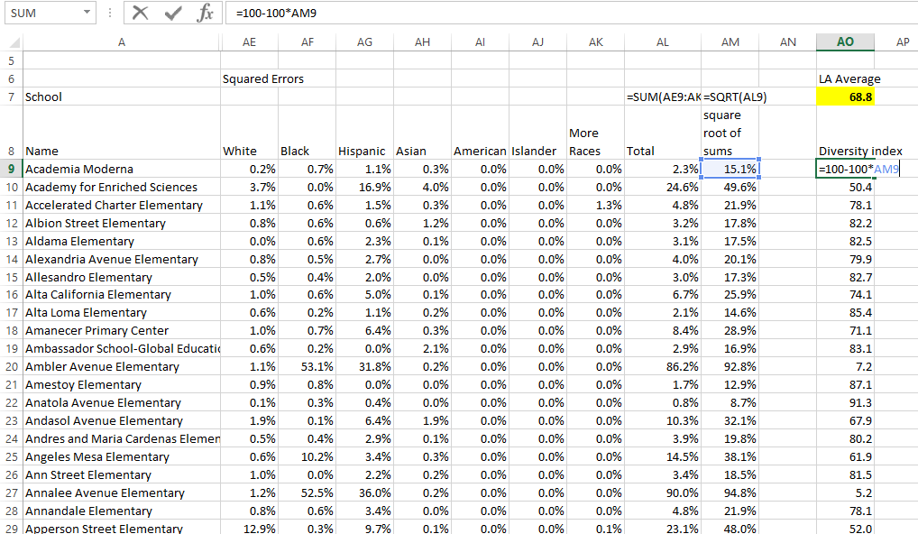
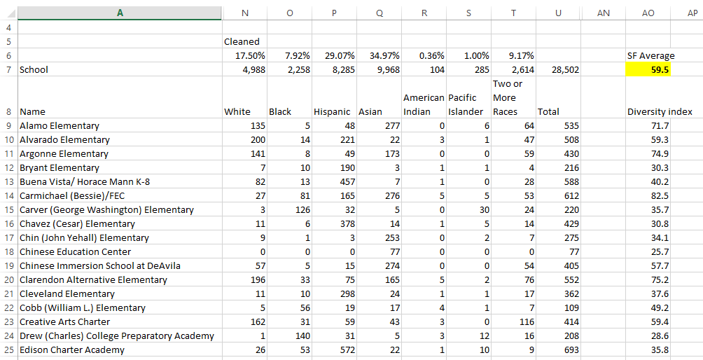
We did the same thing for San Francisco’s elementary schools and were surprised to find that their Diversity Score was lower, at about 60, versus Los Angeles’ score of 69.
Feel free to try it out, and if you are much better than us in Math/Statistics, and you know of a better way to do this, please reach out!
Check out our spreadsheet here: Diversity Index Calculator