
Charts are everywhere – books, newspaper articles, magazines, ads, and even TV shows [Click here for a video clip of How I Met Your Mother]. Valuable, practical, and fun, charts enable us to visualize and understand data. In 3 steps, you can build any chart in Google spreadsheets.
As seen in the clip, Marshall is beyond excited, as he passionately presents a pie chart describing his favorite bars and a bar graph describing his favorite pies. You will soon learn how to create both charts. But wait – there’s more! Google spreadsheets currently offers a variety of graph and chart types, including (but not limited to) line charts, area charts, column charts, scatter plots, GeoMap charts, tree maps, and more.
What chart do you want to create?
Choosing the chart type depends on your data-set and your goal. For instance, column and line charts tend to be excellent way to display changes or differences between data-points of a category. Pie charts are ideal for visualizing proportions of a whole. GeoMaps will designate different colors to specific regions on a map.
Once you know what chart type to create, the data should be organized in a way that is recognizable to the appropriate chart. What do we mean by that? For instance, for a pie chart, the data-range should be organized in two columns: the first column is the label (e.g. McLarens’ Bar) and the second column is the data-point (e.g. 30%). For bar, column, area, and line charts, the data must be organized as follows: the first column is a label and the remaining columns are the numeric data points (with each new column representing a new bar, column, area, or line).
To find out how the data should be organized for a given chart, go to our Resources section at the end of this post.
VIDEO TUTORIALS: Below are videos for specific charts. Each video ranges from 2 to 5 minutes long and can also be accessed by either clicking below or heading to our YouTube channel: youtube.com/spreadsheetsolving
3 Steps to Creating a Chart
Here are the three basic steps to creating any chart in Google spreadsheets.
1. Click on the Chart icon, located near the right side of the menu bar

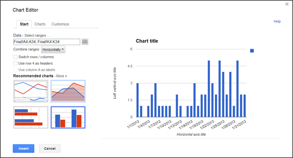
2. The Chart Editor box (shown below) will pop up. On the upper left side, select the proper data range in your spreadsheet. Keep in mind that the data range must be organized appropriately depending on your chart selection, under the “Recommended Charts” section.
3. Start editing! Edit and customize your chart, adding a chart title, axis titles, bar colors, legend, etc. You can do this in 2 ways: First, you can stay in your chart editor box (in step 2) and click on the “Customize” tab. In this tab, you can make all the edits such as title, legend, font, background, etc.

Or, second, you can edit your chart if it has already been inserted into your spreadsheet. At this point, hover over the upper left side and click on the “Quick Edit” button. Now you can then directly customize your chart.

Now you can preview your chart, click Insert, and the chart will appear in your spreadsheet!
Resources
- For a complete list of all currently available charts in Google spreadsheets, please click here: https://support.google.com/drive/bin/topic.py?hl=en&topic=30240