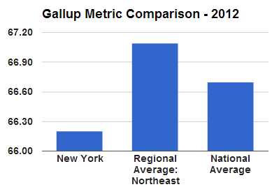
Is the typical New Yorkers’ overall “well-being” better than that of the national average? Nope! How did we quickly conclude this? Check out the graph to the right. Data visualization is an effective (and fun) way to understand information!
Too much information can be overwhelming. But there are ways to channel the desired data and convey it in a way that makes it quick and easy to understand. Let’s discover the power of data visualization by creating a flexible, automatic tool shown below. To see this tool live in action, see our 2-minute video below:
If we have data for all 50 states on various metrics, how can we easily compare a state’s metric to its regional or national average? Creating this user-friendly tool is one such solution!
The Gallup organization surveys and collects various metrics ranging from politics (% of Obama approval, % Republican leaning) to the economy (from Economic Confidence Interval, Job Creation) to well-being (job creation index, % underemployed) to religion (% very religious, % no religion). In total, there are 28 metrics. With 28 metrics for each of the 50 states for a given year, that is quite a bit of data: 1,400 data-points!
Features of this tool:
This tool is flexible, easy, and automatic. As seen in the video above, the chart and data table are spontaneously revised, depending on a user’s selections.
[googleapps domain=”docs” dir=”spreadsheet/pub” query=”key=0ArU-OSCYb_YpdEZ0Vk5uOUpOcjAtalJ5MlRzZGNhOWc&output=html&widget=true” width=”600″ height=”384″ /]
How to create this tool:
Using the Gallup website, export the data on states and metrics into a tab of a spreadsheet, which we labeled Data tab. Now that you have all the info, let’s begin creating this tool. Here we outline a plan in 5 Steps:
- In the Data tab, add a separate column to indicate the region for each state
- Calculate national and regional averages with AVERAGE, SUMIF, and COUNTIF
- In the Output tab, use data validation to let a user choose a state and a metric
- Use VLOOKUP functions to pull in data based on a user’s state and metric selections
- Create a Column Chart
Your Challenge
Try to build this tool! Feel free to rely upon any of our resources, including our video tutorials. If you are stuck, reply below with questions, and we’ll give you some pointers. If you believe you have a solution and are curious about ours, email us and we’ll reply with a link to our spreadsheet.
Once you can create this tool, congrats! You are armed with a skill-set that enables you to tweak the spreadsheet to your liking. For instance, if you prefer to simultaneously compare multiple states, use similar formulas to modify the spreadsheet. If you want to compare a state’s metric across multiple years, you could download the data from Gallup website and incorporate the data into your spreadsheet.
Any other ideas to improve or modify this tool?
where can I get a copy of the data files? and a hint about the proper syntax of vlookup would really help!
Thank you! I’ve emailed you a link to the spreadsheet.