“It’s hard to make predictions, especially about the future” – Various
Usually, improvement in prediction-making comes in two steps. Step 1: Make a Prediction. Step 2: Evaluate how accurate the prediction was, and learn from it. Often times, Step 2 can get overlooked as we move on to future predictions and future weeks of fantasy football. Spreadsheets can help us quickly evaluate how our predictions were, and quickly point out where we might have erred.
In this spreadsheet, our goal is to evaluate the accuracy of ESPN’s Matthew Berry’s week 1 fantasy football rankings projections.
Inputs:
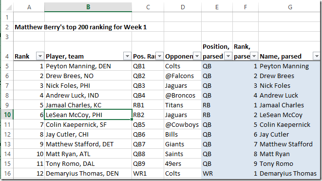
1) Matthew Berry’s Week 1 rankings, entered into our spreadsheet:
Note in columns E-G we do some fancy to get the position, position rank, and name into individual columns. These include string functions, such as LEN, LEFT, and RIGHT. We’ll use these later to filter and evaluate the prediction accuracy by position. Open the spreadsheet to take a look!
2) The actual Week 1 fantasy points scored (plus more functions):
Spreadsheet Output
Now we need to think about how to display the data in a way that answers the question of how accurate Matthew Berry’s rankings were.
The easiest way is to do this is to use a scatterplot to see how closely Matthew Berry’s rankings correlated to the actual fantasy points scored and the actual rankings.
For instance, here we plot rankings (x-axis) against fantasy points (y-axis) for the 148 offensive players ranked (minus Defenses and Kickers):
If we dust off our old regression interpretation abilities, we can say that Matthew Berry’s rankings account for about 25% of the variation in actual fantasy points scored. As a reminder, if Matthew Berry had zero predictive ability, the regression line would have been horizontal and the R-squared would be close to 0. On the other extreme, if he had perfect predictive abilities, all the dots would fall very close to the best fit line in a descending fashion with a high R-squared.
We can also plot predicted ranking versus actual ranking for the 148 players for a similar plot. Ideally this one would ascend in a straight line from (1,1) to (148,148) with slope 1 if the players were ranked perfectly. Instead there is a similar R-sq of 0.25 and a slope of 0.49. A slope of 0 would indicate no predictive power in the rankings:
Interim Conclusion: Making fantasy football predictions is hard!
But, maybe Matthew Berry is better at ranking certain positions than others? Let’s take a quick look, using the same two plots as above. Recall that for signs of good prediction, we want the first chart of predicted rank versus actual points to be downward sloping with a high R-squared, and we want the slope of the predicted vs actual ranks chart to be as close to 1 as possible.
Quarterbacks: Not bad, some room for improvement, the Matt Ryan 31 and Matt Stafford 30 throws a wrench in Matthew Berry’s scores:
Running backs: Not too bad of a performance, it would have been hard to see certain performances ahead of time like Jamaal Charles and Knowshon Moreno.
Wide Receivers: Little bit worse than the above two categories:
Tight Ends: Pretty good showing here, with the highest predicted vs actual ranking (second) chart slope of 0.46:
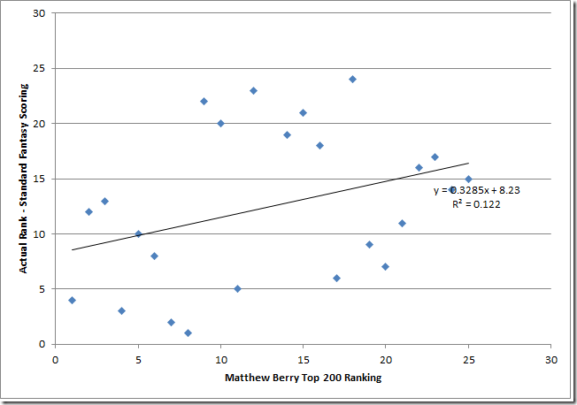
Defenses: Ranking defenses is very hard! Lots of randomness here:
Kickers: Ouch! Ranking kickers is apparently very hard! Or Matthew Berry is bad at ranking kickers! (probably the first one). The positive slope on the first graph and the negative slope on the second indicates that Matthew’s predictions were worse than randomly guessing…


