How to Visualize Data

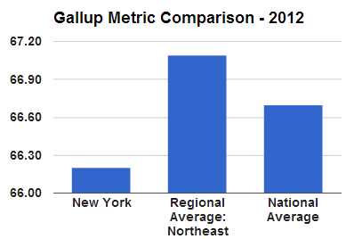
Is the typical New Yorkers’ overall “well-being” better than that of the national average? Nope! How did we quickly conclude this? Check out the graph to the right. Data visualization is an effective (and fun) way to understand information!

Too much information can be overwhelming. But there are ways to channel the desired data and convey it in a way that makes it quick and easy to understand. Let’s discover the power of data visualization by creating a flexible, automatic tool shown below. To see this tool live in action, see our 2-minute video below:

Continue reading “How to Visualize Data”

NYC Subway Passenger Habit Charts

© Photographer Oscar1319 | Agency: Dreamstime.com

The Metropolitan Transportation Authority (MTA) recently published an observational study of subway rider seating behavior. Collecting data over three weeks in late winter 2012, the researchers published their findings on rider seating preferences in a draft report: who finds seats when the train is crowded? Do standing riders prefer vertical bars or graspable handles?  Which seat type do sitting riders take:  seats near a door or bench spots?

Based on some of the data from the report, let’s create visuals – charts that offer us a glimpse into some questions: Continue reading “NYC Subway Passenger Habit Charts”