In honor of Women’s History Month in March, check out our poll below: what percentage of the work force consisted of women in 1948? Keep in mind that just 28 years prior to 1948, women were first granted the right to vote. How have employment patterns by gender changed over time? Let’s use our spreadsheet problem solving skills to figure this out!
[polldaddy poll=6991261]
Problem Solving Overview
Our goal here is to understand employment patterns by gender over time. The first step after we’ve identified the problem is to figure out how to access this data. Fortunately, the Bureau of Labor Statistics (BLS) Current Population Survey does a brilliant job in collecting comprehensive data about the labor force. A monthly survey of households conducted by the Bureau of Census for the Bureau of Labor Statistics, this is an excellent way for us to tap into quality data to dig deeper into our question!
Remember: accessing reliable, accurate data is half the battle! Poor ingredients lead to an unappetizing dish. Inaccurate data generally leads to poor results.
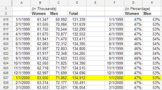
To retrieve historical monthly data, we used the database query tool on the BLS website (note: this requires JAVA) and ran this separately for men and for women. Upon retrieving this data, we had the option to download the data into a spreadsheet from which we organized the data (as shown in columns B and C below). Although the snippet below shows the data beginning on 1/1/1999, keep in mind that our data range is from 1/1/1948 to 11/30/2012.
Let’s not lose sight of goal: to understand the employment patterns by gender over time. As such, our next step should be to calculate what percentage of the workforce consisted of women and men separately – the total of which will equal 100%.
To do this, we first calculate the total number of employed people on a monthly basis. We do this by using the SUM formula and copying and pasting that formula down Column D.
Then to determine the percentages, we divide the number of women by the total number of employed people. So, the formula in cell G627 (the row is highlighted) is B627 / D627. Similarly, we set the formula for H627 to be C627 / D627. We can then copy these formulas and paste them throughout their respective columns, G and H.
What do we do with the data?
Now that we have the monthly employment percentages by gender over time, how do we proceed? A chart or graph can tell us a story by letting us visualize the trends or patterns over time. As such, we introduce to you…the stacked area chart!
An area chart is a powerful way of expressing changes in value between categories of data. This is suitable for our exercise given we are curious about how employment levels have changed between the category of gender. A stacked area chart displays the relationship of the part to the whole, which is even more appropriate given we are interested in the relationship of the number of women employed to the entire workforce (i.e. the percentage of women employed in the workforce).
How do we create a stacked area chart? First, whenever we create a chart, we need to first ensure the formatting of the data source (from which the chart is drawing from) is set up properly. For both area and stacked area charts (the data source format is the same for both!), the first column can be dates or times and the remaining columns will represent an “area” on the chart. Do note that all data values must be positive in an area chart. Also it is usually a good practice to name each of the columns that contain the data.
What do we find?
Check out our embedded spreadsheet below to view the stacked area chart along with the corresponding data table (you can also download a copy – see our resources section below). Do not be confused by our color scheme: red represents men, blue represents women.
[googleapps domain=”docs” dir=”spreadsheet/pub” query=”key=0ArU-OSCYb_YpdEYydXdpWXV3SmtqREtvM1I0UXpCQVE&output=html&widget=true” width=”625″ height=”300″ /]
Based on the data and the stacked area chart, we can conclude that since the 1950’s, the number of employed women in the workforce has been steadily increasing until about 2000, which is when it began to level off.
For our video tutorial, please see below:
References:
Hey there! I simply wish to give you a big thumbs up
for your great info you have here on this post.
I will be coming back to your blog for more soon.
Thanks! If there are any topics you’re interested in, let me know.