[polldaddy poll=6994482]
Over the past several months – or years for that matter – there has been a rush among American parents to teach kids Mandarin. After-school language classes have emerged, immersion programs are gaining popularity, and videos and phone apps focused on languages have sprung up!
A recent Economist article, “Valued-Added Remodeling” (March 16, 2013) even noted that Jack Markell, Delaware’s governor, plans to expand immersion programs, such as those seen in the kindergarten classroom of Mcllvaine Early Childhood Center, where children are taught solely in Mandarin for half of each day.
Now, what’s the connection between our language skills and a spreadsheet?
Through charts and graphs, spreadsheets offer a useful and appealing way of telling a story with data. That is, charts and graphs provide a visual representation that can provide clarity and engage interest.
Take a look below at our GeoMap and key.
[googleapps domain=”docs” dir=”spreadsheet/pub” query=”key=0ArU-OSCYb_YpdF9TTmJOR2praW1yT3JfV0w1MzU1RVE&output=html&widget=true” width=”640″ height=”300″ /]
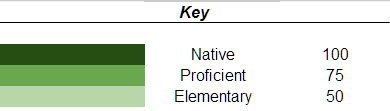
In this case, this GeoMap offers a neat way of showing the degree of proficiency of languages spoken in various countries. For instance, I am a native English speaker, proficient in Mandarin, and have elementary level knowledge of Spanish. This information is all reflected in the chart.
Problem-Solving Overview
When you have data, it is a good idea to take a step back and ask yourself a few questions. Often it can be tempting to jump right into the data and become immersed in the details. Big picture questions to consider (these are just a few and are by far not exhaustive!) include:
- Is my data relevant? Why should I care?
- How reliable or accurate is my data source? That is, can I trust this data?
- Does my data require any revisions or is it “good to go”?
- What are the best ways to represent or display my data?
So, before we begin creating a chart, let’s think about these questions. Our data consists of our language ability. Where can we utilize our language skills across our world? This is the motivating question and why I believe this data is important. Next, the reliability and accuracy of our data depends solely on how objective we are in evaluating my language skills. Assuming we are objective, there are no revisions required. Finally, the GeoMap is an effective way to display the data.
Okay, how do we go about creating and setting up our GeoMap? Check it out in our video below:
Here is another example of a GeoMap in the Washington Post Worldviews blog by Max Fisher: A Revealing Map of Who Wants to Move to the US.