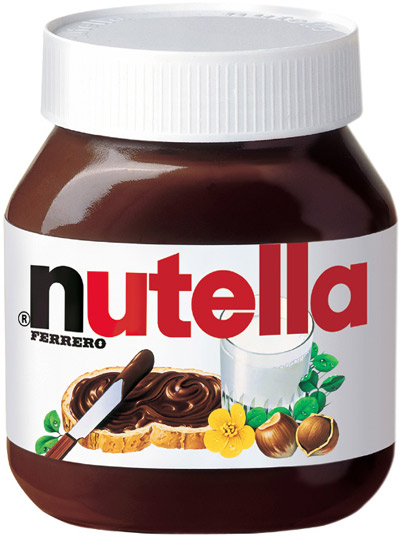
Nutella has recently been a prime target of thefts – from the undergraduate dining halls of Columbia University to a central German town of Bad Hersfeld, where 5 tons of this hazelnut spread was discovered from a parked trailer. Imagine a trailer holding 7,150,000 calories, 780,000 grams of fat, and over 1.5 tons of sugars – all packed in this delicious spread!
What exactly is this prized stolen good? Produced by Italian maker Ferrero, Nutella is a creamy spread that combines roasted hazelnuts, milk, and cocoa. Deliciousness aside, how would we compare its nutrition data to other spreads? Let’s take a look at how we can create a comparative nutrition facts analysis using a spreadsheet.
Creating a “spread”sheet comparative table
Let’s compare the following spreads: Nutella, Skippy Creamy, Smuckers Strawberry Jam, honey, blue agave, and maple syrup. Using company websites and nutritiondata.self.com, we can pull up the nutrition labels and add various data (calories, fats, sodium, carbs, etc) into a spreadsheet, as shown below. An important element to remember: given that we want to create a fair, apples-to-apples comparison, the nutrition facts in our spreadsheet should reflect the same serving size across all the spreads, which in our case, is 2 tablespoons.
[googleapps domain=”docs” dir=”spreadsheet/pub” query=”key=0ArU-OSCYb_YpdHZYaThPcHZhV21NM3pFa0o4QkFUcFE&output=html&widget=true” width=”640″ height=”300″ /]
Note: To view the spreadsheet, go to the Resources section below and click on the link. To edit it, first save the spreadsheet on your Google drive.
Once all the data is included, let’s take a look at the largest and smallest values for each data value across all the spreads. You’ll see these values shown in the far right columns of the spreadsheet. To calculate the biggest value of a set of numbers, use the MAX function. Similarly, to determine the lowest value for a data range, the MIN function will provide you with that output. For more information, view our tutorials on these functions here: MAX & MIN.
We create a quick visual comparison by each nutrition entity based on a key: red represents “unhealthiest” and green, “healthiest.” We assume the following: high calorie, fat, saturated fat, sodium, carb, and sugar levels are “unhealthy” and vice versa. On the flip side, a high protein and dietary fiber count are considered “healthy” and vice versa.
One way to highlight these values in our table would be to use the conditional formatting option. For more details, view the video tutorial here: Conditional Formatting.
What does our data tell us?
Unsurprisingly, the sweeter spreads (jams, honey, maple syrup, and agave) as compared to the nuttier spreads (Nutella, peanut butter) have a better heath rank from a calorie, fat, and sodium content basis but fared worse from a dietary fiber and protein level standpoint.
Agave, a nectar of a plant endemic to Mexico, has been generating quite a bit of buzz as a healthy alternative to sweeteners. While I’m no nutritionist, I was a bit surprised when agave showed the highest carb and sugar levels among the other sweeteners: honey and maple syrup.
Between the two nuttier spreads, an equal serving of Nutella had lower calories, fat content, and sodium than Skippy Creamy peanut butter, but ranked worst with respect to carbs, fiber, sugars, and protein. Among all the spreads, Nutella had the highest level of saturated fats. Oh, well – so it is. This doesn’t seem to thwart the thieves – nor me – from enjoying spoonfuls of this creamy nutty sweetness despite the 12 grams of fat and 21 grams of sugar per serving!
A copy of the “spread”sheet analysis can be found here: Nutella Analysis
